Design
server/app/frontend/entrypoints/app.css · docs/src/styles/global.css
The palette is sampled from a stained-glass rose window. Three material families do three jobs, and the rule for which is which is the whole system.
| Lead | the ground and the neutrals |
| Came | the brass and silver joining the panes — every rule, border, focus ring and eyebrow |
| Glass | the rainbow — links, badges, status, asides, chart marks |
Sign-in follows the reader’s system setting; /manage is pinned dark. Both draw from the same
tokens, so a token changed in one place changes both.
What the window contains
Section titled “What the window contains”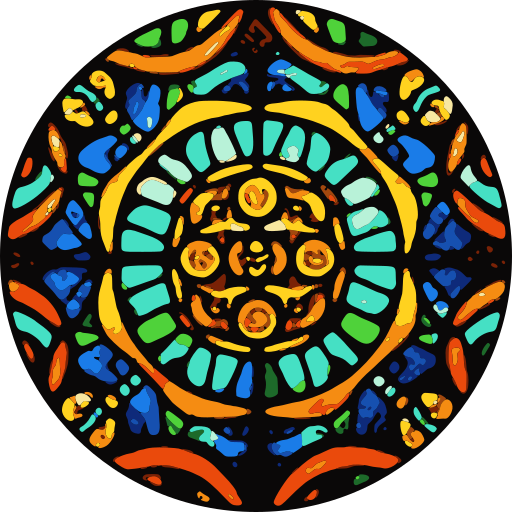
The mark is that window, traced. A photograph of it is smoothed, snapped to thirteen glass colours
with anything near black taken as lead, and each colour traced as one vector layer. The same file is
engine/public/masks-public/icon.svg, the favicon everywhere, the brand in /manage and this site’s logo.
The window it came from is 188×188 and indexed, 28 significant colours. Pure black is 49.3% of it.
Every value lands on 0x2a / 0x55 / 0x7f / 0xaa / 0xff, so these are dithered index entries rather
than chosen colours — too saturated to use directly, but they fix the hues everything else is
derived from.
Black is half the window, so black is the ground of /manage — #000000, not a charcoal. The ramp
above it carries a faint warm cast (OKLCH hue 60, chroma 0.008–0.011) so it sits under brass without
going cold.
The sign-in and account pages ground on #15120f in dark mode and paper in light mode. The mark is
cast across the top of the page as blurred light, and panels are frosted panes with a brass rim that
let that light through. Came and glass keep their jobs there: brass for rules, eyebrows, and focus
rings, and ember glass for the primary action.
Body text is lead-800 at 16.8:1 on the ground. The dimmed text every table and caption uses is
lead-600 at 8.7:1.
In the window, brass and silver are the only things touching every pane. In the interface they do the same job. Came is structure, never state — a brass border says “this is a seam”, never “this needs attention”.
Ten hues, weighted warm. The red shift is in the distribution rather than in one loud control: four hues sit between red and yellow, and the ground and chrome are warm-cast, so the whole system reads hot before any accent is spent.
Every hue is given at two lightnesses — one for the black ground, one for paper. Contrast is measured against the ground each is used on.
| Hue | Angle | On black | Ratio | On paper | Ratio | Role |
|---|---|---|---|---|---|---|
| ruby | 27° | #ff867a |
8.94 | #b53530 |
5.97 | danger |
| ember | 47° | #ff8f53 |
9.31 | #b04000 |
5.87 | signal |
| amber | 68° | #f19c29 |
9.53 | #a44f00 |
5.68 | categorical |
| gold | 92° | #d4ad03 |
9.78 | #8b6200 |
5.46 | warning |
| verdant | 140° | #78c966 |
10.35 | #267e05 |
5.16 | categorical |
| emerald | 165° | #1dcf98 |
10.43 | #008450 |
4.76 | success |
| cyan | 195° | #00cecf |
10.73 | #008386 |
4.57 | categorical |
| sky | 228° | #00c2fe |
10.15 | #0077b2 |
4.90 | info |
| cobalt | 258° | #70b1ff |
9.42 | #2065c5 |
5.63 | note |
| violet | 292° | #b49dff |
9.21 | #6e50be |
5.91 | categorical |
Three rules
Section titled “Three rules”Ruby is the only solid fill. Signal and danger are 20° apart, which is not enough hue separation
on its own, so they separate by treatment instead. Every other control is an outline or a ghost, and
a solid #d3403a fill means one thing: this destroys something. Nothing decorative may use ruby.
Came is structure, glass is state. If it is a border, a rule, an eyebrow or a focus ring, it is brass or silver. If it carries meaning — a badge, a status, a link, an aside — it is glass. A panel never borrows a glass hue for its edge to look lively.
The spare hues are categorical, not decorative. Amber, verdant, cyan and violet are assigned by
hashing a name, so a namespace or a scope keeps the same colour everywhere it appears — a table
in /manage, docs example, chart series. Colour becomes identity rather than garnish.
Where it lives
Section titled “Where it lives”One daisyUI theme pair replaces the three that came before — light, dark and console. /manage
no longer has a separate palette; it is the dense expression of the shared one, keeping 3px
fields and tight rows while drawing every colour from the same place.
@plugin "daisyui/theme" {  name: "rose";  prefersdark: true;  color-scheme: dark;
  --color-base-100: #0f0b09;   /* lead-050, surface */  --color-base-200: #000000;   /* lead-000, ground  */  --color-base-300: #292421;   /* lead-200, line    */  --color-base-content: #e9e5e2;
  --color-primary: #ff8f53;    /* ember, signal */  --color-secondary: #b58a41;  /* brass, came   */  --color-error: #ff867a;      /* ruby    */  --color-warning: #d4ad03;    /* gold    */  --color-success: #1dcf98;    /* emerald */  --color-info: #00c2fe;       /* sky     */
  --radius-field: 3px;  --radius-box: 5px;}
/manage pins it with data-theme="rose"; sign-in leaves it unstamped and follows the system. This
site maps the same values onto Starlight’s --sl-color-* variables, so it inherits the palette
rather than approximating it.
Unchanged, and deliberately plain: Helvetica Neue with an Arial fallback, and a mono stack for client ids, URLs, scopes and figures. No display face and no webfont — spacing, grid, colour and hierarchy do the work.